Project Visual Identity

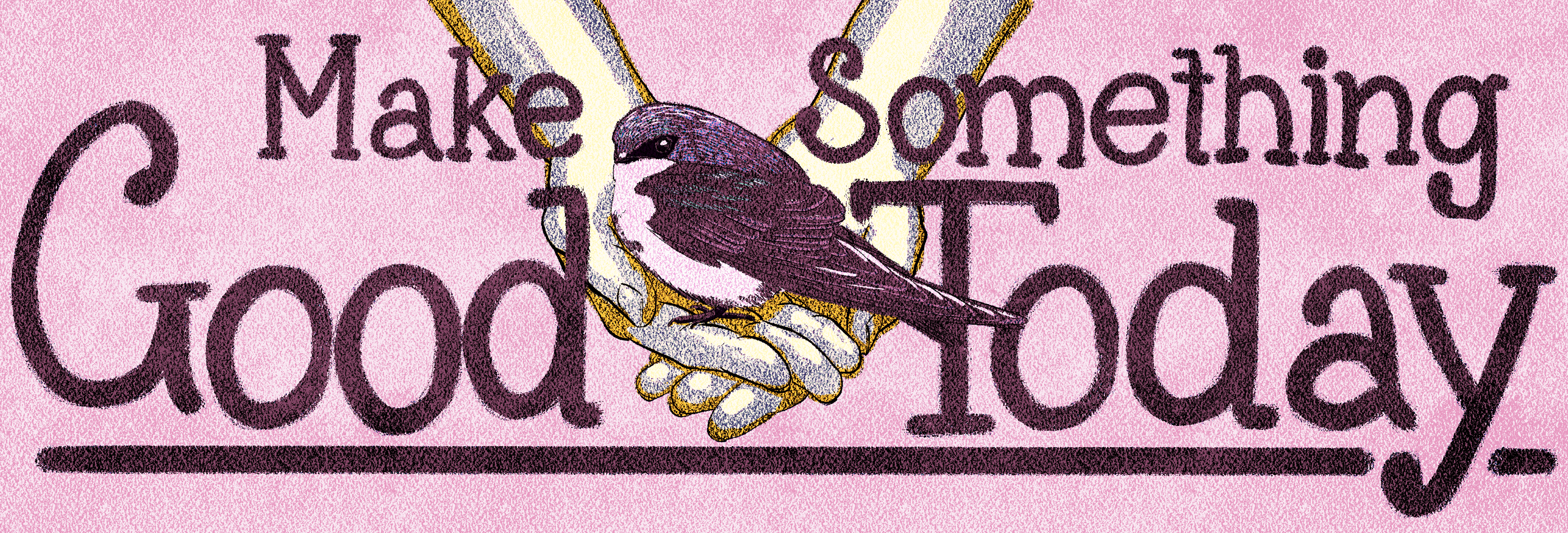
I'm thrilled to share two logo variants, each crafted with my own hand lettering and illustrations. One features a captivating circle design, while the other opts for a simpler approach. Drawing inspiration from the client's original logo, I've infused colors that resonate with their brand identity. Additionally, I've introduced a luxurious gold-green hue, offering versatility for printed materials.


In addition to the core identity, a curated set of icons was meticulously designed, serving as visual representations of the client's ethos and values. Complementing this, a bespoke pattern was crafted, adding depth and character to printed materials, further enhancing the project's visual identity.


